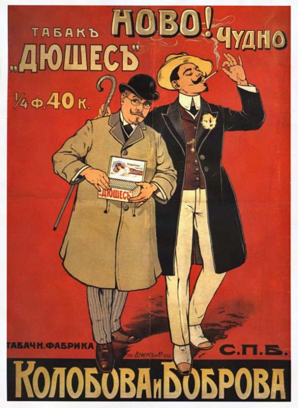
The first styles of Hobo were released by ATF in 1910. There are different theories about why Hobo is called Hobo, one being that it was left behind in the drawers of designer Morris Fuller Benton for so long that the typeface was known as “the old Hobo”. Other people think it was inspired by a Russian cigarette poster where the word ново (new) can be seen at the top. But it appears, the inspiration for Hobo’s letterforms came from a different word on the poster — Чудно. (Read the full story here.)
Ella Cursief
The year is 1915 and the typeface is Ella Cursief. While the name might imply that it is intended for the ladies that can’t be true because women do not even have the right to vote yet. Honestly, this is a typeface that simply cannot be pinned down by something so mundane and banal as a stereotype.
Lady Speaker Sorts
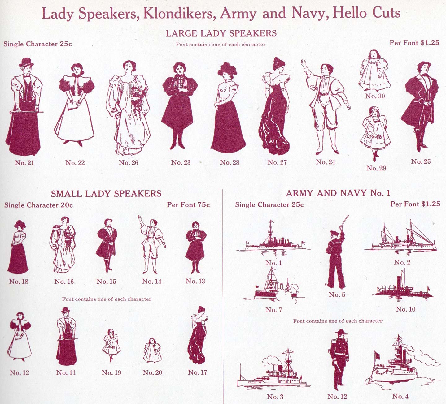
Turns out, it’s never been that hard to find Lady Speakers after all
Although readily available in recent years, it’s still worth mentioning there was no shortage of Lady Speakers in 1915. Yes, both Large Lady Speakers and Small Lady Speakers were made easily accessible and affordably priced. (Special shoutout to Meghan Arnold and Nina Stössinger for their help with finding this image in the 1912 ATF catalogue).
Bodoni
You know the problem: you set your mind on a typeface and then it’s not available in your size, format, or for the machine you have. 😞 In the case of Bodoni, this just got a little less likely to happen.
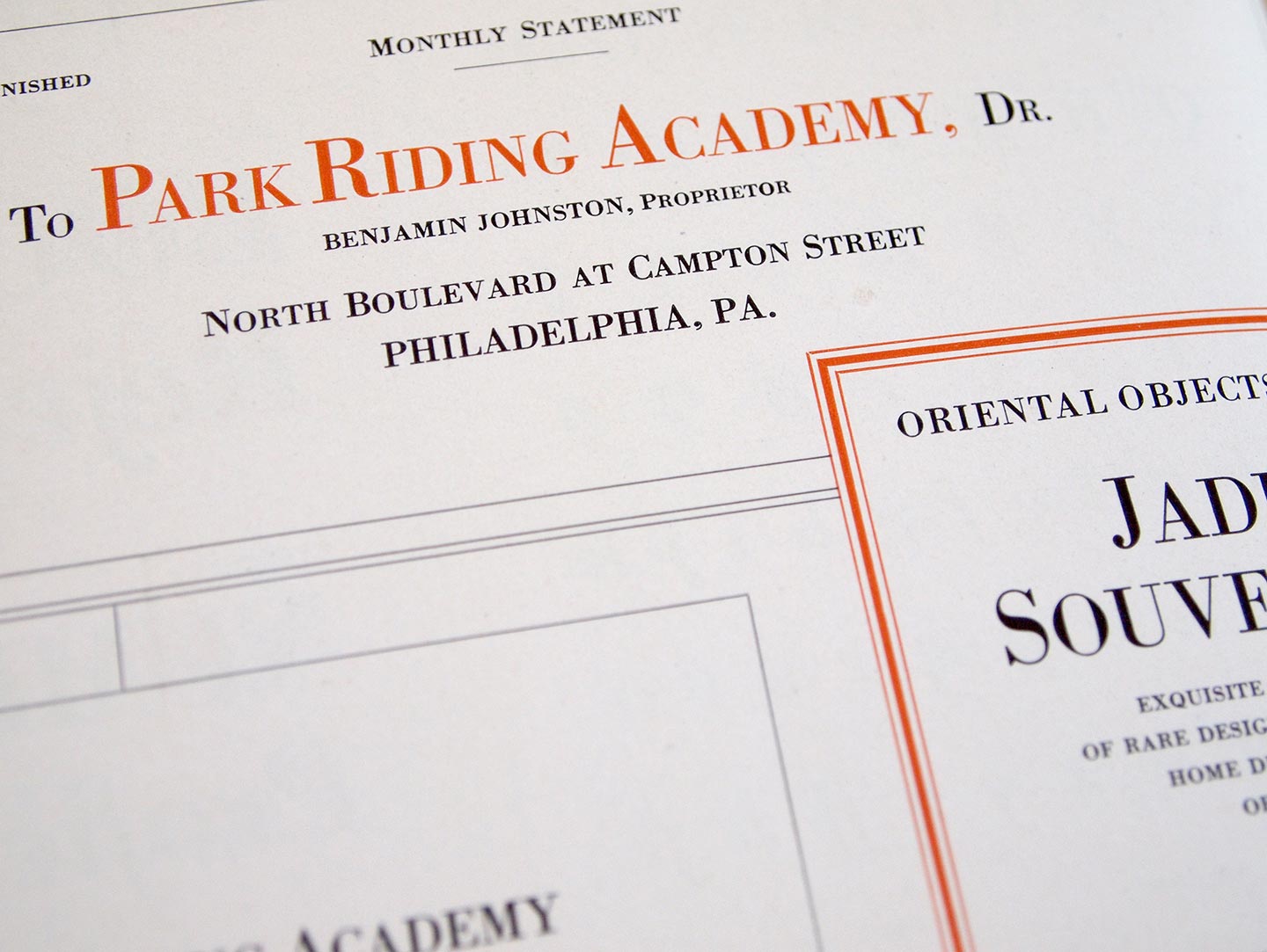
Yum. Fake Small Caps
Card Bodoni for one is the latest style in the expansive ATF Bodoni series. Like virtually everything at ATF, it was drawn by Morris Fuller Benton as an adaption of their standard smash hit to an all-caps titling face (meaning, cast on the full body without descenders). This is especially handy for the setting of forms, cards (duh) and other stationary. A few glyphs like J, Q and punctuation were changed so that they do not reach below the baseline.
Swapping 950 times— Talking with Sol Kawage
After a month filled with inspiring posts written by many of the ’bettes, it’s time to mark Women’s International Day with a new interview. Although I think the fact that there is a Women’s day shows that we are far from reaching equality, I will still use this date as an excuse to celebrate Alphabettes and the connections that we are able to make here. Our next interviewee will touch a bit on gender roles and sewing, which I find perfect for today.
In the last interview, Shelley nominated Sol Kawage. I didn’t know Sol, perhaps because we missed each other by a year at Reading, but I was so happy to get to know her through this interview. I am sure that you will feel the same, so sit back (with a nice glass of wine and cheese!) and enjoy this read.
Alphabettes News — December 2015 and January 2016
It is back to regular programming after a month of Love Letters, and we are here with news from December 2015 and January 2016. There is a lot to read, so dive right in!
Tamye Riggs is ATypI’s new Executive Director
Tamye, who is a writer, editor, and designer specializing in typography and the related arts, and served both as founding board member, and then executive director of the non-profit Society of Typographic Aficionados (SOTA), is now the Executive Director of the Association Typographique Internationale (ATypI).
Round-table discussion about women in type and Alphabettes at TypoMad in Madrid
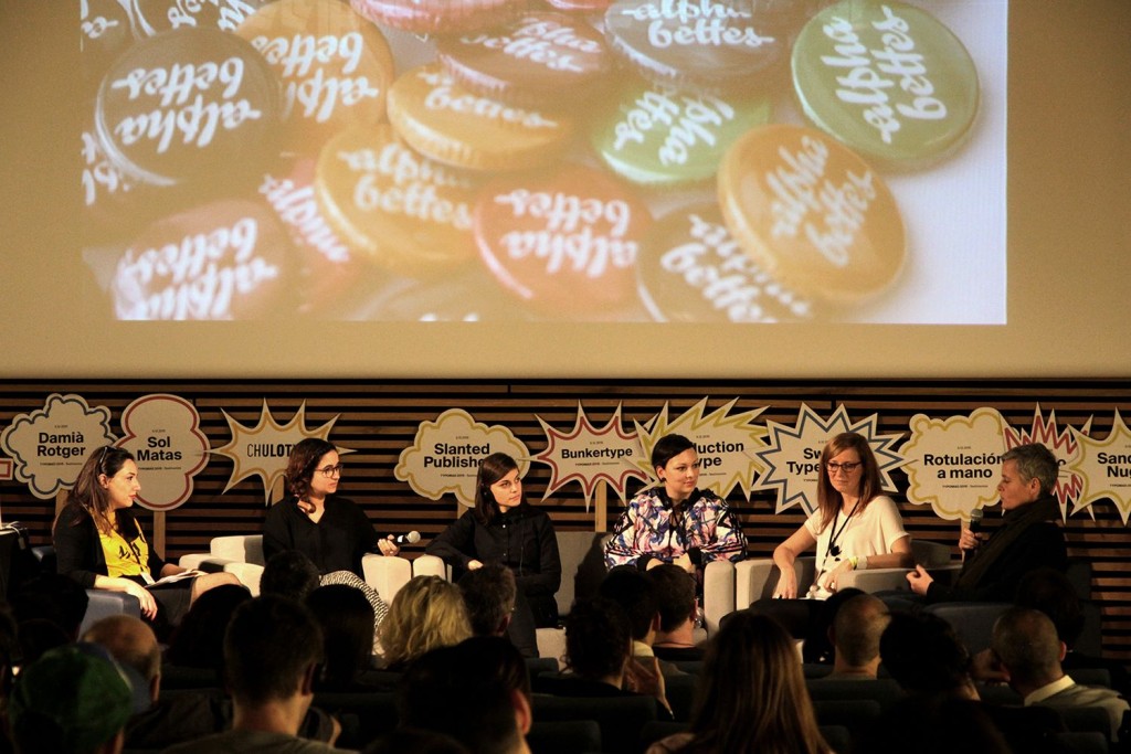
Alphabettes Sol Matas, Sandrine Nugue, Julia Kahl, Veronika Burian, and Tânia Raposo participated in a round-table discussion moderated by Nora García at TypoMad in Madrid to talk about women in the world of typeface design and Alphabettes. Read more about the type conferences in December here. (photo below by TypoMad).
The Love Letters
During the month of February 2016, Alphabettes contributors opened their minds and hearts to create the Love Letters series. From Rio to Bangalore, Spain to California, we were taken on a world-wide tour of beloved treasures, found objects, personal histories and typographic ephemera. Enjoy the collection and let’s do it again soon.
Pooja Loves Newspapers
2016 is a leap year, and all thanks to that I get to be here a second time to profess my love for one more thing. Even though I haven’t bought a newspaper to read the news in years, every time I spot a newspaper whose copy I don’t own, I need to buy it. What started as a couple of innocent purchases has turned into an obsession—some would even call it love!
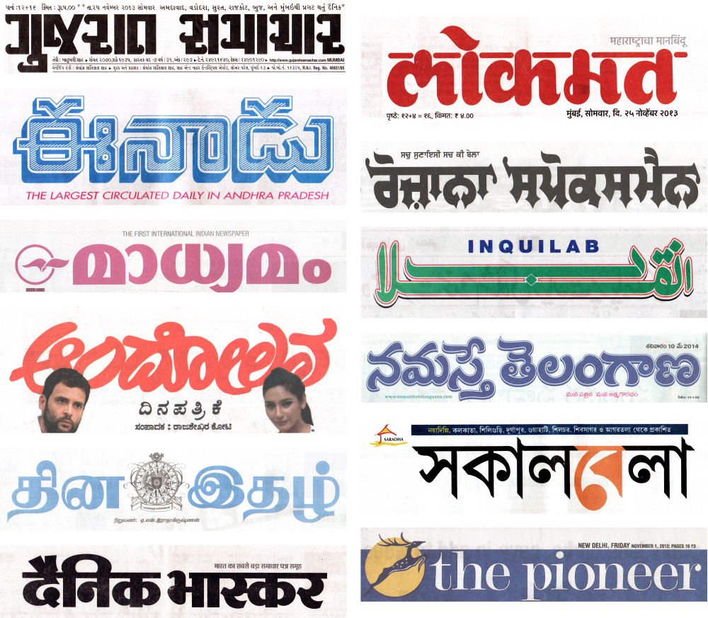
A sample of nameplates from Indian newspapers (from top to bottom): Gujarat Samachar (Gujarati), Eenadu (Telugu), Madhyamam (Malayalam), Andolan (Kannada), Dinaethal (Tamil), Dainik Bhaskar (Devanagari), Lokmat (Marathi in Devanagari), Rozana Spokesman (Punjabi in Gurmukhi), Inquilab (Urdu in Nastaliq), Namasthe Telangana (Telugu), Sakal Bela (Bengali) and The Pioneer (English)
Nina (Sometimes, Despite Everything) Loves Bad Design
I had one hell of a hard time deciding what to write about. I considered writing about specimen books or lettering manuals, flea markets or abandoned factories, house numbers or old advertising signage, puns or portmanteaus or the state I go into when I draw type at night; things that capture me completely and fill me with deep joy and sometimes make me feel like I have little pink hearts bubbling out of my ears.
But I also love just looking: at tiny, unremarkable, mundane things; and even weird or bad design that only makes limited sense outside its target audience. And, I may not be part of that audience, especially when I’m traveling (which I love for this reason, too: an outside look at things). I often get a kick out of the amazing, impenetrable kind of bad we often overlook.
So I decided to write about Sant’Anna.
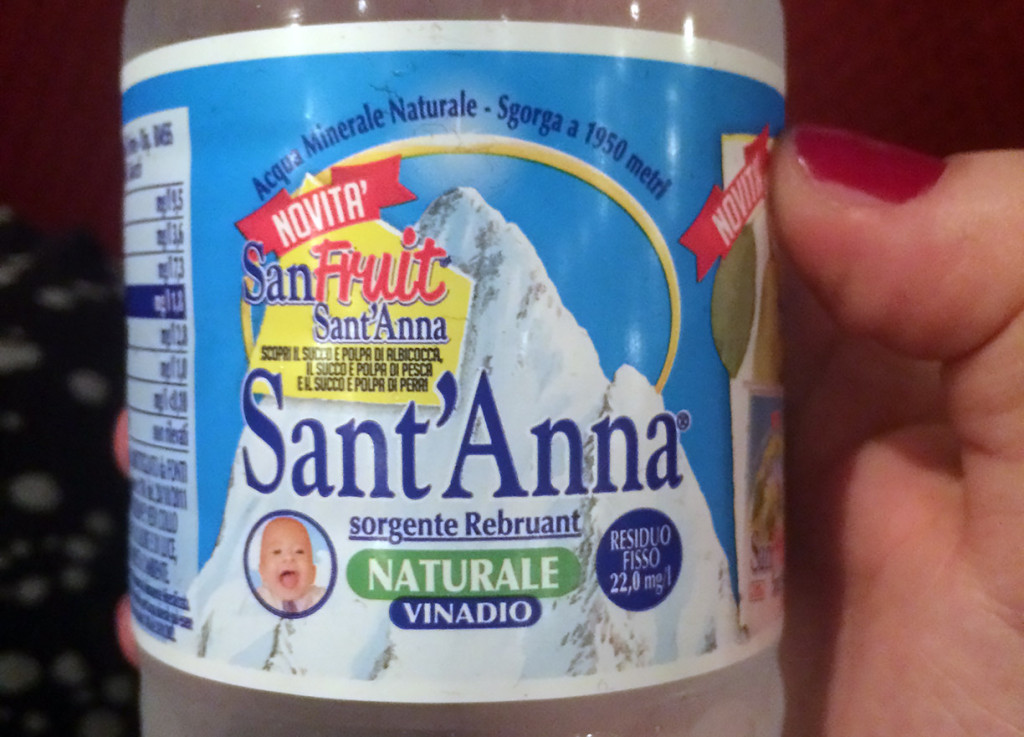
Wait what?

